Bug #3691
closedJButton labels truncated on macOSX
0%
Description
I've been ignoring this bug forever. In os x, jbutton labels are truncated. IMO, this sort of thing is a big turn off for new users.
For example:
Search on Components tab is instead "Sear...."
Data => Search (Sear....)
Data => Sources (Sou....)
Data => Cancel (Can....)
etc.
Files
Updated by Derik Barseghian over 16 years ago
I haven't looked at this in complete detail, but our issue seems like that described here, under "Radar #6219608":
http://developer.apple.com/releasenotes/java/JavaLeopardUpdate2RN/ResolvedIssues/chapter_3_section_4.html
I've tried the workaround and it works -- results in labels that fit on smaller square buttons on os X (see attachment), and no visual change on Linux and XP afaict. I'll wait for opinions before check-in -- is this not what we want because it doesn't look mac-like? Or maybe there's a better fix not requiring the shape to change...
Updated by ben leinfelder about 16 years ago
same thing is happening in Morpho. Though in Morpho, you can set the L+F as a preference: pretty buttons vs buttons you can read?
Updated by Derik Barseghian almost 16 years ago
I think Matt wants the buttons to follow native l+f (i.e. don't use the square buttons i posted).
Updated by Derik Barseghian almost 16 years ago
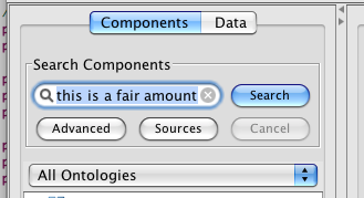
I've checked in a fix; I made the buttons 11px bigger. I've removed some other spacing trying to minimize the widening of the Kepler left pane - it's now 27px bigger.
I've made some other changes trying to save space and clean up the interface:
The Search button is now to the right of the search textfield.
I've removed the Reset button. Reset can be accomplished by deleting text and hitting enter. I've added a jtextfield property so that on the mac you may also Reset by clicking the little x inside the textfield.
I've left space for a slightly larger 'Advanced' button for advanced search. See attachment to see how that will look when the time comes. There was already spacing setup for this, but it was too wide, IMO, so I made it smaller.
Updated by Derik Barseghian almost 16 years ago
I'll leave this open for now until others have had a chance to see the new ui and possibly object.
Updated by Matt Jones almost 16 years ago
Looks great to me, Derik.
By the way, is this the only place where button labels were truncated, or are there other dialogs where this is also a problem?
Updated by Derik Barseghian almost 16 years ago
Good point, I haven't seen any others so far. If anyone sees any other button label truncation please report here.
Updated by Derik Barseghian almost 16 years ago
Crawl reports the Refresh button on the Data sources is also truncated.
Updated by Derik Barseghian almost 16 years ago
Refresh button fixed. Closing. For some reason had to comment out setMaximumSize, even though SearchUIJPanel uses the same dims, I think the same font, does a setMaximumSize, and has no problem fitting "Refresh" on one of its buttons. Not going to try to track down the reason, since there's ample space.